

How to Make Your Showit Website Look Good on Mobile When Your Business Is Amazing in Person
I used to walk into medspas and dermatology offices for a living.
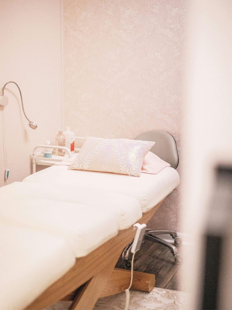
Beautiful spaces. Aesthetics on point, care and intention with every interaction, and people really good at what they do.
And then I would go home, pull up their websites, and I could not wrap my head around the disconnect.
Websites that were outdated. Imagine this: text you had to pinch and squint to read. Weird scrolling on mobile. Recently SEO-optimized photos? Probably not.
I saw it over and over again. These incredibly talented estheticians and medspa owners who had built something genuinely stunning in real life, but their websites were just sitting there like an old book on a shelf collecting dust. Not doing anything. Not reflecting their amazing work.
And to be honest, I get it. You are running a full business. You are doing consultations and treatments, then following up with clients, and managing a team, and somewhere in there trying to have a life. Learning how to make your Showit website look good on mobile is not exactly at the top of that list.
But here is the thing I kept thinking about.
Your website is usually the first thing a potential client sees before they ever step foot through your door. And if it feels clunky or off on their phone, they are already forming an opinion. One that has nothing to do with how good you are at what you do.
That felt like a problem worth solving. My skin was changed as someone who has eczema through those office experiences. If I can help business owners who are changing people’s lives by their services, I am absolutely for that.
Hey, I’m Sarah – a Showit website designer who works specifically with beauty and wellness businesses. I have a background in Computer Science and spent years in pharmaceutical sales working alongside the exact kind of businesses I now build websites for. I started By Sarah Hawk because I kept seeing the same gap and knew I could help close it. If your website could use a little attention, my free training – The Website Glow Up – walks you through 3 simple upgrades to help you attract better clients starting today.
Why So Many Stunning Medspas and Wellness Studios Have Websites That Look Like an Afterthought
Here is what I figured out after years of walking into these spaces.
The people running them are really good at what they do. Like, really good. They have spent years mastering their craft, building client relationships, creating environments that feel luxurious and intentional down to the last detail.
But websites? That is a completely different skill set.
And nobody told them that.
So what happens is this. You launch your business, you know you need a website, you throw something together or hire someone to do it quickly, and then you move on. Because you have actual clients to take care of. Treatments to perform. A business to run.
The website just sits there.
Maybe you picked a pretty template. Maybe it looked fine on your laptop when you set it up three years ago. But you never really looked at it on your phone. Or you did once, winced a little, and told yourself you would fix it later.
Later never came.
I get it. I really do. You did not get into business to become a web designer. You got into it because you love helping people feel confident in their skin.
But here is the thing I kept running into.
Your physical space gets updated. Your skills get sharper. Your offerings evolve. And your website just stays frozen in time like a snapshot of who you were when you started, not who you are now.
That gap between your in-person experience and your online presence? Potential clients can feel it. Even if they cannot put words to it.
The Mobile Mistakes I See Beauty and Wellness Brands Making Over and Over Again
So what actually goes wrong on mobile?
After looking at hundreds of beauty and wellness websites on my phone, I started noticing the same things popping up again and again. And honestly, most of them are so easy to miss when you are building on a laptop.
Here are the big ones.
Text that is way too small. Like, squinting-in-bright-sunlight small. If someone has to pinch and zoom just to read your service descriptions, they are already one tap away from leaving.
Buttons that are difficult to click. You know those tiny little links that look fine on desktop but turn into a game of precision finger tapping on a phone? Yeah. Those.
Images that get cropped in weird places or just look off. That gorgeous photo of your treatment room? On mobile it might be showing half a wall and cutting off the good stuff entirely.
Spacing that feels off. Things that had room to breathe on a big screen suddenly look crammed together or have awkward gaps. It just feels cluttered even if nothing technically moved.
Menus that do not work the way people expect. Or worse, menus that take three taps to find.
I cannot tell you how many times I have pulled up a stunning medspa site on my laptop, thought wow this is beautiful, then opened it on my phone and immediately thought… wait, is this the same website?
The thing is, most of your potential clients are looking at your site on their phones first. Not at a desk. Not on a laptop. On their phone, probably while waiting somewhere or scrolling before bed.
And if that experience feels clunky or hard to navigate, it does not matter how beautiful your desktop version is.
They have already moved on.
Simple Design Moves That Make Your Showit Site Feel Polished and Intentional on Any Screen
Okay so now that you know what is going wrong, here is the part I actually love.
Fixing it is not as complicated as it sounds.
When I started digging into what made some Showit sites feel polished on mobile and others feel like a mess, it came down to a handful of small decisions. Not a full redesign. Not starting over. Just a few intentional tweaks that make a huge difference in how the whole thing feels.
Here is what actually moved the needle for me.
Font size first. If your body text is sitting below 16px on mobile, bump it up. I know it might feel big when you are looking at it on a desktop, but on a phone screen it is going to read exactly the way it should. Comfortable. Clear. Like something a real business put thought into.
Next, your tap targets. Buttons, links, menu items. If someone has to aim for them like they are playing a game, they are too small. A good rule of thumb is anything you want someone to click should feel easy to hit with a thumb, not a cursor.
Then look at your images. Pull up your site on your actual phone and scroll through every single page. Not on desktop preview mode. On your phone. Check where your photos are getting cropped. Check if the thing you actually want people to see is visible or if it got cut off somewhere nobody intended.
And spacing. Give things room. White space is not wasted space. It is what makes a site feel elevated instead of cluttered. The difference between a site that looks like a luxury medspa and one that looks like a flyer from 2009 is often just breathing room.
None of this is magic. But when you do all of it together? The whole thing just clicks into place.
Font Pairings and White Space Tricks That Actually Match the Aesthetic of Your Physical Space
Here is where it gets really fun.
You spent so much energy curating the look and feel of your physical space. The right lighting. The right textures. The color palette that feels calm and intentional the second someone walks in. And then your website is using a font that looks like it came with a free template and was never questioned.
That mismatch is something people feel even when they cannot name it.
Your fonts are more important than you think. A serif font that feels editorial and high-end on desktop can look thin and hard to read on a phone screen. A script font that looks gorgeous in a header can turn into a squinting situation the second the screen gets smaller. On mobile, legibility is the thing. If someone has to slow down to read it, the vibe is already broken.
What actually works is simple. One clean, readable font for your body text. Something with enough weight to hold up on a small screen. Then one personality font, used sparingly, for a headline or a section title. That is it. Two fonts doing their jobs really well beats four fonts competing for attention every single time.
And the pairing that tends to hit for beauty and wellness brands?
A soft sans-serif for body. Something like a light geometric or humanist style that feels modern without being cold. Then a thin serif or an understated script for the moments where you want a little warmth or elegance. Think of it like your treatment room. Most of it is calm and clean. Then there is one candle, one piece of art, one detail that makes it feel like you.
That is what your font pairing should feel like too.
Now white space. I cannot tell you how many websites I have looked at where everything is crammed together like the designer was afraid of empty space. On mobile this gets even worse because things that had room on a desktop suddenly feel stacked on top of each other.
White space is not nothing. It is what makes the things on your page feel intentional instead of chaotic. It is the reason a luxury skincare brand’s website looks different from a coupon flyer even when both have the same information on them.
On mobile, I pay attention to three spots in particular.
Padding around text blocks. If your words are running right up to the edge of the screen, add space on both sides. Even 20 to 30 pixels makes it feel like a real brand made this.
Space between sections. When one section ends and another starts, give it room to breathe. A clear visual break tells the reader their brain gets a moment to catch up before the next thing.
Space above your headlines. A headline that has room above it lands with more weight. One that is crammed under the thing before it just disappears.
To be honest, when I started paying attention to this stuff, it changed how I saw every website I looked at. And once you see it you really cannot unsee it.
Your physical space communicates something the moment someone steps inside. Your website should do the same thing the moment someone lands on it. The fonts and the space you leave around things are a huge part of how that happens.
How Showit’s Native Mobile Builder Lets You Control Every Detail Without Learning to Code
Okay so here is the part that honestly made me fall in love with Showit.
Everything we just talked about. The fonts, the spacing, the cropping, the tap targets. You can fix all of it yourself. Without touching a single line of code. Without calling a developer. Without watching a six-hour tutorial on YouTube.
Showit builds your desktop and mobile versions separately.
That is the thing that changes everything. Most website platforms are trying to take your desktop design and automatically squeeze it down to fit a phone screen. And sometimes it works okay. But a lot of the time it is just guessing. And you have seen what that guessing looks like.
No guessing. Showit gives you a separate mobile canvas where you are in control of exactly how everything looks on a phone. You can move things around, resize text, hide elements that do not serve the mobile experience, adjust spacing. All of it. Visually. By dragging and clicking.
I cannot even tell you how many times I wished other platforms did this.
So practically speaking, here is what that looks like.
You pull up your Showit editor and toggle over to mobile view. You see your actual phone layout. If your headline looks too big or your button is sitting in a weird spot or your image is cropped in a place that makes no sense, you just fix it right there. Move it. Resize it. Give it more padding. Done.
No code. No guessing. No submitting a support ticket and hoping someone gets back to you.
And the best part?
Changes you make in mobile view stay in mobile view. You are not accidentally breaking your desktop version every time you tweak something. They are independent. Which means you can get both versions looking exactly the way you want without playing a game of whack-a-mole every time.
For someone like me who grew up loving technology, this kind of control is everything. But even if tech is not your thing, Showit was genuinely built for people who want a visually customizable site.
Your services are worth showing off. Showit makes sure your website looks good on mobile and desktop. Without needing a computer science degree.
Frequently Asked Questions
Do I need to redesign my whole website to fix how it looks on mobile?
No. Most of the time it comes down to a handful of specific tweaks, things like adjusting your font sizes, adding padding (spacing) around your text, and checking where your images are actually cropping on a real phone screen. No starting over, no messing up your desktop version.
What if I already tried adjusting things in mobile view and it still looks off?
This happens more than you would think. Usually it comes down to one of two things. Either the changes did not save properly, or the issue is actually in your desktop canvas and it is carrying over. My go-to move is to check that the element you are adjusting is actually unlocked and editable in mobile view, then toggle back and forth between desktop and mobile to see where the problem is really living. Nine times out of ten, once you find the right canvas, the fix takes about thirty seconds.
What if I am not sure my website is actually hurting my business or if it is fine the way it is?
Honestly, the easiest way to know is to pull up your site on your phone right now and scroll through it like you are a potential client seeing it for the first time. If you find yourself wincing or thinking I really need to fix that, you have your answer. Your gut reaction is usually right, and the fact that you are even asking the question tells me part of you already knows.
Your Website Can Finally Match What You Have Built
With these updates wow you know your website can attract new clients on mobile. Not someday. Not after some massive overhaul. With a few intentional tweaks you can make yourself.
If you are the kind of person who wants to roll up their sleeves and go deeper on website strategy to attract dream clients. You can grab my free Glow Up Training.
And if you are sitting here thinking I do not want to do any of this myself, I just want it done?
I get that too.
That is exactly why I created The 2 Week Magnetic Website. I take care of everything so you can get back to doing what you actually love. You can check it out here whenever you are ready.
Options available to you whenever you’re over patching together your website plan and hoping for the best. Over here, I believe technology can work for you in life and business, and I’m happy to share more tips and tricks with you along the way.
Rooting for you,
Sarah
I hope this post has given you plenty of ideas on how to use technology to work for you! In case we haven’t met digitally yet…
Hi! I’m Sarah, a Showit website designer for beauty and wellness business owners who are ready to ditch the social media grind and attract better clients with a website that works for you, like the best sales rep you’ve ever hired. I truly believe technology should work for you, not against you.
Please continue to read and learn on the Blog, but if you’re ready for the next step…
Subscribe to Wired for More: If you want easy-to-understand tech tutorials and website strategy from a former teacher, then you’ll love The Wired for More Newsletter. It combines education and self-improvement all in one, without overwhelm.
Explore ways to Work Together: If you’re ready for a website that not only looks good but works 24/7 then my services may be the next best step to showing up online in a way that truly feels in alignment with your wellness-based business goals.
If You Want to Say ‘hey!’: Follow along on the ‘gram
If you liked this post, Pin it to Pinterest! 👇🏻

Sarah Hawk is a Web Designer and tech educator in Rochester, MN who helps wellness-based business owners ditch tech overwhelm. With a background in teaching and pharmaceutical sales, she blends strategy, design, and education to help service providers launch websites that look professional, feel aligned, and support real business growth, without the confusion. When she’s not behind the computer, she loves aesthetic coffee shops, systems, strength training, and testing new recipes for her family.
Explore web design services and resources at bysarahhawk.com
Previous Post
Next Post
If your website is sitting out there while you're wishing your dream clients were finding you, then this is your next move to go from unnoticeable to magnetic.